
At Brick Factory, we’ve spent years building and managing websites for nonprofits. Over time, a clear pattern has emerged: some nonprofit sites look great but don’t actually do anything. They don’t grow email lists, they don’t convert donors, and they don’t reflect the quality of the organizations behind them.
To help nonprofits take stock of where they stand, we recently launched the Brick Factory Nonprofit Web Grader — a free tool that evaluates nonprofit websites across nine categories. This post walks through each one and explains what separates a good nonprofit site from a great one.
1. Good Design
Your website is often the first impression a potential donor, volunteer, or partner will have of your nonprofit. Design shapes credibility before a visitor reads a single word.
Typography matters more than most organizations realize. Font choices signal tone: academic and authoritative, modern and optimistic, traditional and institutional. When headlines are strong and body text is easy to read, content becomes more engaging. The Obama Foundation does this well, using clean, bold typography that reflects its sense of purpose.
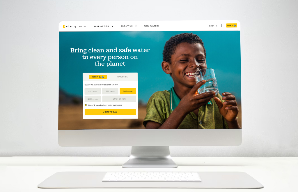
Photography and video are your most powerful tools. Real photos of real people and real programs do more to inspire action than any statistic. charity: water is the gold standard here. Their homepage leads with stunning field photography that makes the water crisis visceral before a visitor reads a single sentence.
Strong nonprofit design also answers three questions quickly: Who are you? What do you do? Why does it matter? The Trevor Project does this well. Their site immediately communicates what they do, who they serve, and how you can help, without making visitors hunt for it.
Clear calls to action tie it all together. Every page should have a purpose and a logical next step, whether that’s donating, signing a petition, or learning more about a program.
2. Ease of Use
A beautiful nonprofit site fails if visitors can’t find what they’re looking for. Ease of use is about removing friction.
Navigation should be focused, typically five to seven top-level items, with labels that make sense to the public rather than to internal staff. If your navigation uses acronyms or program names your audience doesn’t recognize, it isn’t working.
Search is especially important for nonprofits with large content libraries. It should be prominent and return useful results quickly.
Page layouts should be easy to scan. Clear visual hierarchy, generous white space, and short paragraphs make content easier to consume and more likely to drive action.
St. Jude Children’s Research Hospital is a good example of a large, complex site that handles all three of these elements well.
3. Performance
Page speed is not a technical detail. It is a business decision. Research from Google consistently shows that each additional second of load time increases bounce rates. For a nonprofit trying to convert a first-time visitor into a donor, a slow site is costly.
Several factors contribute to strong performance:
- Images should be properly compressed and served in modern formats
- JavaScript and CSS files should be minimized and loaded efficiently
- Server response times should be fast
- Unnecessary plugins and third-party scripts should be kept to a minimum — every one you add increases load time
Google Lighthouse and Google PageSpeed Insights are the standard tools for evaluating performance. High-performing sites should aim for scores of 90 or above on both mobile and desktop. These tools also measure Core Web Vitals, including Largest Contentful Paint, Interaction to Next Paint, and Cumulative Layout Shift, which affect both user experience and search rankings.
4. Responsiveness
More than half of all web traffic comes from mobile devices. For nonprofits serving younger audiences or communities with limited desktop access, that number is often higher.
Responsive design means your site adapts cleanly to any screen size without sacrificing usability. Navigation should collapse neatly, text should be readable without zooming, and buttons should be large enough to tap.
This applies to forms too. Donation forms and email sign-ups must be easy to complete on a phone. Long or complicated forms are a barrier on desktop and an even bigger one on mobile.
There’s an SEO dimension here as well. Google uses mobile-first indexing, which means it evaluates the mobile version of your site when determining search rankings. A poor mobile experience doesn’t just frustrate users, it can suppress your visibility in search.
5. Clear, Impactful Content
Content is how nonprofits communicate mission and demonstrate results. The strongest sites use it to build trust, not just describe programs.
Impact storytelling is the most effective approach. Instead of explaining what you do, show what happens because of what you do. Stories of real people and communities affected by your work help visitors understand why it matters.
Statistics reinforce credibility. Numbers like meals served, families housed, or dollars directed to programs give donors confidence that the organization is making a real difference. St. Jude and the American Cancer Society use impact data well throughout their sites.
Content should also be structured for how people actually read online. Most visitors scan. Short paragraphs, clear subheadings, and occasional bullet points make content easier to absorb.
And content has to stay current. Outdated news pages and stale impact reports undermine the credibility you’re trying to build.
6. Ease of Email Sign-Up
A website visit is temporary. An email address is a relationship.
Too many nonprofits treat email sign-up as an afterthought, dropping a small form in the footer and calling it done. High-performing sites treat it as a core conversion goal and place sign-up opportunities prominently across key pages, especially on interior pages that attract significant search traffic from first-time visitors.
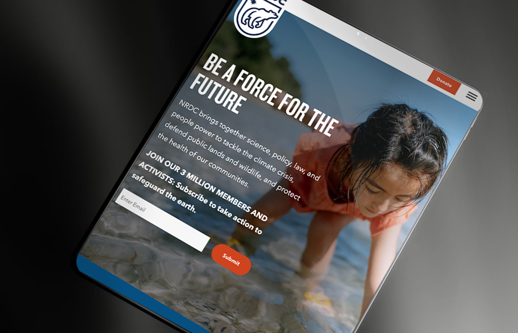
The ask matters too. “Sign up for our newsletter” is not very persuasive. Stronger sites explain what supporters will actually get, such as impact updates, ways to take action, and insights into the work. NRDC does this well by framing email sign-up as joining a movement rather than joining a list.
Keep the form short. Name and email address is usually enough. Every additional field reduces completion rates.
7. A Powerful Donation Experience
For most nonprofits, donations are the lifeblood of the organization. The donation experience should be designed with the same care as an e-commerce checkout.
Start with visibility. A Donate button should be clearly visible in the main navigation, and donation prompts should appear throughout the site at natural moments — after an impact story, at the end of a program page.
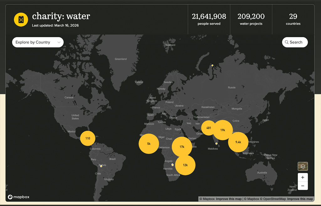
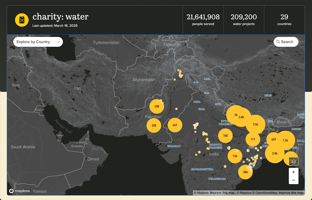
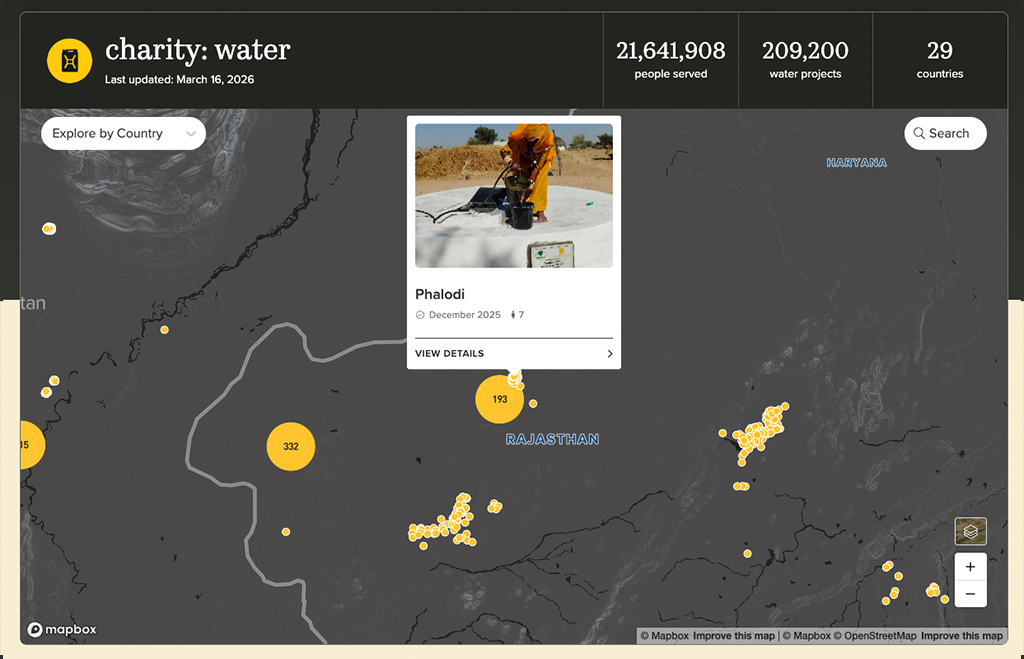
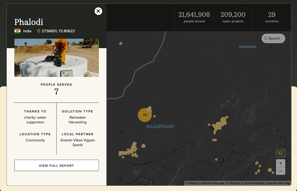
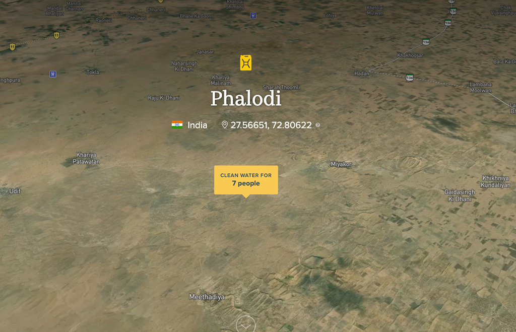
Clarity about where money goes builds trust. Donors are more likely to give when they understand what their contribution supports. charity: water does this exceptionally well, connecting individual donations to specific projects and showing supporters exactly what their funding makes possible.
Recurring giving is worth special attention. A donor who gives a small amount each month typically contributes far more over time than a one-time giver. High-performing sites make recurring giving easy to find and clearly explain the impact of ongoing support. The Sierra Club and the International Rescue Committee have both invested heavily in this and it shows.
Finally, the form itself should be fast, mobile-friendly, and as short as possible. Offering multiple payment options also helps reduce abandonment.
8. Accessibility
Web accessibility ensures that people with disabilities can fully use your site. For nonprofits, this is especially important because many organizations serve communities that include people with disabilities.
Most organizations aim to meet WCAG 2.1 AA standards. Key elements include:
- Sufficient color contrast between text and backgrounds
- Alt text for all images
- Captions for video content
- The ability to navigate the entire site using only a keyboard
- Proper heading structure so screen readers can interpret pages correctly
Tools like WAVE, Axe, and Google Lighthouse can scan pages and flag common issues. They don’t catch everything, but they’re a practical starting point.
9. SEO and Generative AI Optimization
Organic search is still one of the most important channels for reaching new audiences. And increasingly, nonprofits also need to think about visibility in AI-generated answers, not just traditional search results.
The fundamentals haven’t changed. Clear heading structure, descriptive page titles and meta descriptions, fast load times, clean URLs, and an XML sitemap are all essential. These signals help search engines understand and index your content correctly.
Structured data is becoming more important. Schema markup tells search engines and AI tools specifically what your content is about, including:
- Your organization’s name and mission
- Upcoming events
- Staff profiles
- Programs and services
Organizations that implement schema correctly are more likely to appear in rich results and to be referenced by AI tools like ChatGPT, Claude, and Google Gemini.
That last point is where things are changing fast. These tools increasingly answer questions by synthesizing information from trusted sources on the web. Nonprofits that want to be cited need to publish authoritative, clearly structured content about their issue area, maintain an accurate About page, and build the kind of resources that establish genuine expertise.
See How Your Site Stacks Up
If you want to know where your nonprofit’s site stands across these nine areas, try the Brick Factory Nonprofit Web Grader. It’s free, takes a few minutes, and gives you a clear picture of what’s working and what isn’t.
If you’d like to talk through the results or discuss a redesign, we’re happy to connect.